

IN WHAT WAY DOES YOUR MEDIA PRODUCT USE FORM AND CONVENTIONS OF REAL MEDIA PRODUCTS?
The title of our film is called “The Suppressed” and this sums up the whole story of our film. The genre isn’t as clear within the title name however when it is presented in our trailer, it becomes obvious that we have made an action/adventure, specifically superhero, film. As shown BELOW. We based our design off of the many superhero films, were we found a common colour scheme and design throughout. This is present through the main films we used to influence the title design: Dr Strange, Spiderman: Homecoming and Guardians of the Galaxy. Within these films, I found that they all consisted of the colour yellow and grey-blue tones, as did many other superhero films. We decided that we should continue this common reappearance of the colours in our colour theme as I would create a common and recognisable link to the others superhero films. In addition, it also worked perfectly with the supernatural gifts we gave our character and allowed there to be strong connection with the use of colours we used within the editing of the film and the title design, especially when we decided to use a shot for the background of our title.
The font we chose for this is called Trashed and it reflected the flames that electrified off of our main character, Clary’s, hands, much like we found that the title in Spiderman: Homecoming reflected the webs that he could shoot from his wrists.

WE CREATED THE TITLE THROUGH PHOTOSHOP. TO GET THE SHADOW EFFECT WE DOUBLED UP ON LAYERS AND SEPARATED THEM WITH DIFFERENT COLOURS. THEN WE PLACED THE YELLOW ON TOP OF THE BLUE AT AN ANGLE THAT WOULD PRODUCE THIS DEPTH.
WE CREATED THE TITLE THROUGH PHOTOSHOP. TO GET THE SHADOW EFFECT WE DOUBLED UP ON LAYERS AND SEPARATED THEM WITH DIFFERENT COLOURS. THEN WE PLACED THE YELLOW ON TOP OF THE BLUE AT AN ANGLE THAT WOULD PRODUCE THIS DEPTH.
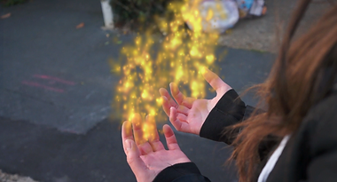
THIS IS THE SCENE WE DECIDED FOR THE TITLE TO APPEAR ONTO. THE PHOTO SHOWS HOW IMPORTANT THIS SCENE IS AS CLARY FINALLY REVEALS HER POWERS, GIVING THE AUDIENCE A GREATER UNDERSTANDING OF THE FILM NAME AND THE NARRATIVE.
THIS IS THE SCENE WE DECIDED FOR THE TITLE TO APPEAR ONTO. THE PHOTO SHOWS HOW IMPORTANT THIS SCENE IS AS CLARY FINALLY REVEALS HER POWERS, GIVING THE AUDIENCE A GREATER UNDERSTANDING OF THE FILM NAME AND THE NARRATIVE.


AS MENTIONED ABOVE, I USED FILMS SUCH AS; SPIDERMAN: HOMECOMING, GUARDIANS OF THE GALAXY AND DR STRANGE TO INFLUENCE OUR TITLE DESIGN.
CLICK THE IMAGES EITHER SIDE TO BRING UP THE TITLE RESEARCH AND DESIGN PREZI AND THE TITLE SURVEY: AUDIENCE FEEDBACK POWERPOINT ON OUR BLOG.
TITLE RESEARCH AND DESIGN
BY ZOE STANNARD
TITLE SURVEY ANALYSIS
BY ZOE STANNARD
The transition of the background fading into darker tones came from the Guardian of the Galaxy title design because we found that the yellow colour, used in their design, illuminated off the bleak tones of the background shot so we thought that because our title was going to use a similar colour theme of the yellow and blues, it would be interesting to use a background shot and darken the tones with a fade to make the title illuminate and dominate the screen, along with the flames that came off the character’s hands. This would put more importance and emphasise on the key features of the shot and enhance the impact it presents to the audience when it appears on the screen.
The transition of the background fading into darker tones came from the Guardian of the Galaxy title design because we found that the yellow colour, used in their design, illuminated off the bleak tones of the background shot so we thought that because our title was going to use a similar colour theme of the yellow and blues, it would be interesting to use a background shot and darken the tones with a fade to make the title illuminate and dominate the screen, along with the flames that came off the character’s hands. This would put more importance and emphasise on the key features of the shot and enhance the impact it presents to the audience when it appears on the screen.


The doctor strange title design influenced the design for our title by the way the text lifted off the baCKground. it possesses a subtle 3d effect, which we would like to incorporate into the design of our title so that it stands our from the shot that we have used in the background.
watch the video to see the final title design on our trailer.
Our mood board presents the classic comic book themes for the film and emphasises the superhero powers.

CLICK THE IMAGE TO BE TAKEN TO OUR MOOD BOARD PREZI ON OUR BLOG.
CLICK THE IMAGE TO BE TAKEN TO OUR MOOD BOARD PREZI ON OUR BLOG.
The narrative of our film uses the forms and conventions of stereotypical superhero films due to our main character, Clary, being involved in experiments and being kept within a hospital that doesn’t consist of the ‘good’ kind of doctors. This uses the assumptions of the superhero’s background where they have kept them against their free will and used them to advance a Doctors knowledge in the supernatural field of biological science. The films that used a similar kind of storyline are: Wolverine and Logan, Spiderman and Deadpool. We have however, developed and modified our story to create a different perspective and more unique spin on the story.
THESE CLIPS SHOW THE SCIENCE EXPERIMENT THAT TRANSFORMS LOGAN INTO WOLVERINE AND WADE INTO DEADPOOL.
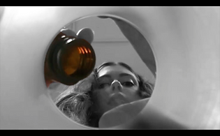
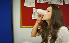
WE PUT EMPHASISE ON THE MEDICATION THAT CLARY WAS TAKING BY MAKING THE MEDICATION THE ONLY COLOURED OBJECT IN THE SCENE. FROM THIS OUR AUDIENCE WOULD BE ABLE TO PICK UP ON THE UNCOMFORTABLE AND ISOLATED ENVIRONMENT THAT HAS BEEN IMPLIED THROUGH THESE EDITS IN ORDER TO MAKE THEM QUESTION WHETHER THE DOCTORS ARE 'GOOD'.
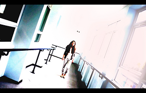
THE TITLE USED ON THE CAMERA AS CLARY WALKS DOWN THE CORRIDOR WAS THERE TO CONTINUE THE DISTORTED AND UNCOMFORTABLE ATMOSPHERE THAT WOULD BE REFLECTED ONTO THE AUDIENCE. THE OVERPOWERING LIGHT FROM THE SCENE WAS EXAGGERATED TO CREATE AN ILLUSION AND TO REPLICATE THE CLARY'S MENTAL INSTABILITY.

FURTHERMORE, WE WANTED TO PRESENT CLARY'S EMOTIONAL PAIN BY FILMING THE PORTRAIT SCENE WHERE SHE HAD A MENATL BREAK DOWN. THIS GIVES THE FIRST IMPLICATION THAT THE MEDICATION ISN'T HELPING HER AND IS CAUSING HER PAIN. THE SCREAM ADDS TO THE TRAUMA OF THE SCENE AND CONFIRMS TO THE AUDIENCE THAT THIS ISN'T A NORMAL MENTAL HOSPITAL WITH THE 'GOOD' DOCTORS.

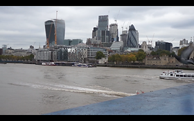
The locations we chose reflected a common appearance within superhero films, specifically Capitol cities. We shot in London, opposite City Hall and next to Tower of London and Tower bridge. We found that this gave us the best views and lighting as well as being important enough to suggest that the Government Scheme Censor could be based around there. It also emphasises the power and control the Censor scheme has over the country, implying the corrupt antagonists are far superior within the politics of how the country is run. This fit in with the conventions of a superhero film because after analysing many we discovered that many important and high action scenes tend to surround a Capital city, typically New York and London. Furthermore, allowing us to pursue more interesting and dramatic scenes within the city, to build the tension and suspense within the audience.
AN EXAMPLE OF THIS IS IN THE FILM DOCTR STRANGE, WHO ENDS UP BEING THE PROTECTOR OF NEW YORK.
THIS VIDEO SHOWS DR STRANGE FIGHTING IN NEW YORK.
BELOW ARE PHOTOS FROM OUR TRAILER OF THE SCENES SHOT IN LONDON. THE SCENES ARE BASED AROUND REVEALING THE HEAD OF CENSOR SCHEME AND HOW SHE IS LINKED TO THE CAPTURING OF CLARY. THIS LETS OUR AUDIENCE KNOW WHO THE ANTAGONIST IS.

CLICK THE IMAGE TO BE TAKEN TO OUR BLOG WHERE YOU CAN VIEW THE DECISION PROCESS OF SELECTING THE LOCATIONS.


We used empowering female roles throughout our film, with the main character, Clary (who possess superpowers), and the head of the organisation of Censor (who suppresses the people with superpowers). These are very important roles within the film as they portray power and strength, which typically is seen within male roles within the superhero film genre. Wonder Women was a very inspiring film that influence the way we used our female characters within our storyline. We chose specific outfits and appearance to present these women as being bold and driven, but not as far to complement the male gaze (this is explained further in the challenge page because I find this part of our movie to go against the stereotypical conventions).
WITHIN THE CLIP FROM THE OPENING SCENES OF WONDER WOMEN, SHOWS A CONFIDENT AND EMPOWERED WOMEN. HER KNOWLEDGE AND STRONG PRESENCE ON THE SCREEN INSPIRED THE FEMALE ROLES IN OUR FILM.
WOMDER WOMEN IS PORTRAYED TO BE INTELLIGENT AND POWERFUL, WHICH IS EXACTLY THE PRESENCE WE WANTED OUR CHARACTERS TO REFLECT TO THE AUDIENCE.

THE IMAGE TO THE LEFT SHOWS CLARY AS A BOLD AND STRONG CHARACTER THAT SHOULD BE FEARED. THIS IS THROUGH THE USE OF ALL BLACK CLOTHING THAT MAKES HER LOOK EMPOWERED AND CONFIDENT.
THE IMAGE TO THE RIGHT SHOWS THE ANTAGONIST, WHO IS THE HEAD OF CENSOR. SHE IS PRESENTED IN SAMRT AND FROMAL CLOTHING TO EMPHASISE HER POWERFUL ROLE WITHIN THE GOVERNMENT.


CLICK THE IMAGES TO BE TAKEN TO OUR BLOG WHERE CAN VIEW EITHER:
THE COSTUME AND MAKE-UP DECISION PROCESS.
THE GENRE ANALYSIS AND USES WITHIN OUR FILM.


THE CHARACTER AND REPRESENTATION PRESENTATIONS BY
ZOE STANNARD
LILY MORL
WHERE WE TALK ABOUT THE FINAL DECISIONS ON EACH CHARACTER REPRESENTATION IN MORE DETAIL.
