HOW EFFECTIVE IS THE COMBINATION OF YOUR MAIN PRODUCT AND AnCILLARY TASK?
i have split this question into three parts. i spend the first two sections (main product and ancillary button) explaining the decision process of creating the main product and ancillary task and then in the third section (combination button) i go on to talk about the cross media convergence and synergy of the main task and ancillary task together.
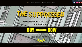
In the MAIN PRODUCT WE PRODUCED A TRAILER FOR OUR OWN FILM.
I believe that our trailer is very effective through the complexities of the camera shots, dialogue, narrative, editing and sound that we have used.
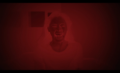
Our narrative especially gives an interesting twist towards the popular and stereotypical superhero genre of film because of the repetition of films you see within this genre. The bases of our storyline, that is shown in the trailer, is about a girl called Clary, who possesses powers. However, she is being suppressed on medication in a mental hospital causing her to lose her powers as well as any memory she has of them. The trailer shows her having a mental breakdown due to the reaction of the medication and displays a memory that she is unsure of as being real. It then goes on to hint at the Censor scheme that is behind all of this and presents the antagonist (head of the Censor scheme). There are a few ambiguous gaps within the trailer towards Clary’s sister, who is seen in the memory but isn’t named or shown anymore.

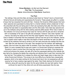

CLICK AN IMAGES TO VIEW EITHER THE PITCH OR THE SHOOTING SCRIPT ON OUR BLOG.
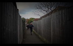
The camera shots we use are very creative and unique in some sense because we wished to show the audience a different point of view when it came to presenting our film. I think that these shots contribute to the ISOLATED ENVIRONMENT WE WANTED TO CREATE AND IS One of the most intriguing and impacting shot is the portrait shots as we use a normal close up on the melt down of Clary’s character as she begins to remember her past. The simplicity of the shot enhances the expressions on Clary’s face and highlights the delicacy of the lighting that creates shadows on her face and adds more depth to the frame. You can see this below: This video is the unedited shot. Later on I describe the use of our editing to this shot.
Another effective scene is the when Clary pours the medication into the cup. To increase the tension and suspense, we placed the camera inside the cup so that it would film the medication filling the cup. This creates a dramatic scene that emphasises the medication and continues to imply that something more sinister is going on.


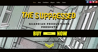
In the ancillary task we produced a website, magazine (front cover) and poster for our film.
-notes how well the cover of the magazine, poster and website match extra.
CLICK THE IMAGES TO BE TAKEN TO OUR BLOG WHERE YOU CAN VIEW THE PRESENTATION YOU HAVE SELECTED.
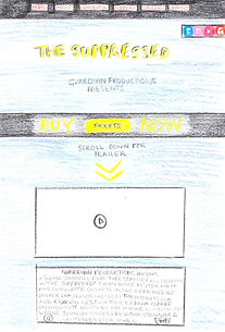
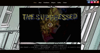
The website was challenging because we had to come up with an idea that would allow our audience to become interactive and involved in the storyline. We had seen this done through many film websites, such as thecapital.pn (http://www.thecapitol.pn/) for The Hunger Games film. This is seen as a huge success within the fan base and got the audience very excited and waiting in anticipation for the films. We were inspired by these types of websites to create a similar style to our own. So we decided to use the fact that we had an uncertain feature in our storyline, where we made the audience question whether our main character had powers or not. From this we made the website split into two different synopsis, where our audience can choose their own storyline and debate about which one they think is true. Adding this element to our website gave us the ability to advertise our film to a whole new level and gave our audience the ability to become a part of the narrative and see a more complex and interesting storyline to a stereotypical superhero film. I think this enables us to gain greater audience, who will be more engaged when watching our film.
besides the choice in storylines, we also have a home page, about page, contributors page, gallery, bloopers and contacts page. on the home page we displays the title of our film, production company, the trailer, with billing block underneath and a script across the front, which advertises ticket sales. the colour scheme is the same as the trailer, magazine and poster, with the vibrant yellow text shown through out the website. the background of the site is a photo of an important hospital scheme within the trailer and complements the colour theme and enhances the comic book effect because of the poster edge filter that we put on it. we also display icons to our social networking sites to keep our fans interested in the film by allowing them to follow and keep up to date with the cast and how the film is coming along. the contributors page lets the audience get to know the director and cast by telling them information of past acting jobs and their background. the addition of the gallery and blooper page allows the audience to see what happens behind the scenes and get to know the cast better, which lets them be consumed and engaged within our film.
our website address is https://guardianproduction6.wixsite.com/thesuppressed
click the button below to be taken to our website.
CLICK THE IMAGES TO BE TAKEN TO OUR BLOG WHERE YOU CAN VIEW THE PRESENTATION YOU HAVE SELECTED.
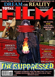
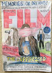
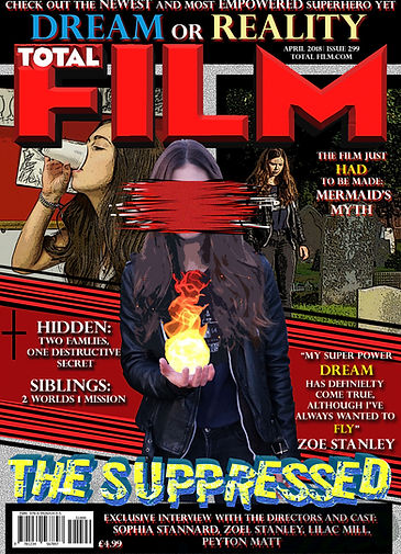
When creating the magazine, I found that I had to concentrate on adding specific features to the front cover that I had seen within the magazine I chose. This meant that the research and planning was so important towards this task as I had to analyse Empire and Total Film in much detail to understand the basics of a magazine front cover and then apply the specific/unique features Total Film displayed to my Total Film magazine front cover.
I chose Total film because I found that is incorporated more features of a magazine. From my research, which can be found on our blog, I was able to construct a plan for the magazine that I found I needed to develop when producing it.
MY MAGAZINE DESIGN WAS INSPIRED BY THE INCEPTION TOTAL FILM FRONT COVER BECAUSE THEY ADAPTED THE STYLE OF THE MAGAZINE TO FIT WITH THE DISTORTED AND ARCHITECTURAL THEMES FROM THE FILM. CLICK THE MAGAZINE RESEARCH AND PLANNING LINK AND THE MAGAZINE DEVELOPMENT LINK FOR MORE DETAIL INTO MY DESIGN.
I used Photoshop for this ancillary task and was able to us the build-up of experience from previous task towards the production of my front cover. With this I wanted to go against the stereotypical one image presents of the main characters of the film, displayed on the front covers. Our film is about a girl with a multiple of personalities and in a way very different identities/lives, meaning that to just display on image of this character wouldn’t portray the true characteristics of our main character and the most important and engaging part of our film, especially when we want to draw the attention of our target audience.
This means that I added a selection of three images of our main character to the front cover, placing and editing them purposefully. On either side of the magazine are two sub identities of our main character, the suppressed part of her life (on the left side) and the ghosts of her past (on the right side). Placed in the middle is an image of her true self, or what she thinks is true (where she presents her powers). This image dominates above the others as it is the most important and most eye catching reflection of our film. I have edited this image to cover her face with a red flash like flame because I wanted to imply the idea of the different identities and that she isn’t just one person, it also relates strongly to an edit we used within our trailer, where she has a break down and begins to change and we place a red filter on top of this scene to enforce this idea.
In addition, I also have tried to present the magazine in a comic book style layout because of the similarities between our story to actual comic books, plus it allows our target audience to recognise this theme and be drawn to the magazine. Furthermore, to enhance the comic book feel to the cover I used poster edge filter effect on the images as well as lightened up the brightness and contrast of the images to create that colour-popping and artistic style that all comic books possess.
The colour tones used within this magazine match the colour theme used throughout the poster and website however, there is more red tones than expected because it connects well to the master head.
I added a teaser to the left of the magazine, across a red banner that separates the dominating image from the rest of the magazine, and it hints towards the other films that are talked about in the articles inside. The cover line sits on top of all the features and matched the one we use for the poster and in our trailer. To the right of the red banner is a quote that is used within one of the interviews taken from an actor in our film, this way the audience can really have a seek peek at the most interesting and intriguing articles inside.
At the very top of the magazine is the tag line of the film ‘DREAM OR REALITY’, which I think creates an ambiguous question that our audience will be taunted by what the answer could be. Especially as this links so well to the theme of our website, that features the option of choosing your own storyline within our film and lets them debate between which one they think this the right one. This is a bold and dominating part of the magazine cover as we want this to start the engagement and anticipation of the film.
Below the cover line is the plug, which allows the audience to see the topics covered about the film, in the articles.
CLICK THE IMAGES TO BE TAKEN TO OUR BLOG WHERE YOU CAN VIEW THE PRESENTATION YOU HAVE SELECTED.
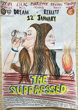
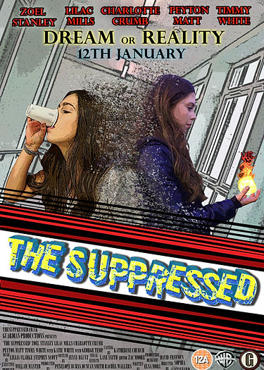
When creating the poster I tried to link the style very closely to the magazine front cover because these medias are very important to catch the audiences eye and get them onto our website so if they look very similar than it will be easier to recognise the film. This means I used the same comic book style along with the same idea of showing our main characters two different identities/lives.
I came up with a less overwhelming design for the poster compared to the magazine front cover because after my research and planning on film posters, it was clear that they possessed less features to a magazine. MY POSTER DESIGN WAS INSPIRED BY THE SPIDERMAN, BLACK PANTHER AND STAR TREK FILM POSTERS BECAUSE THEY ALL PRESENTED MULTIPLE CHARACTERS MEDGED TOGETHER IN DIFFERENT WAYS AND THIS INFLUENCED MY DECISION TO PRESENT THE TWO PERSONALITIES OF OUR MAIN CHARACTER SEPARATED BY A DISINTEGRATION EDIT.
I became to understand the sole purpose of a film poster is just to catch the eye of the potential audience and to spark an interest in them enough to get them to go read a magazine on the film or look up their website or social medias or trailer. So when creating my design I focused on the images and how I would contrasts the different lives in a complementary and unique way. This is when I used YouTube tutorials on Photoshop edits to inspire my design and I came across the disINTEGRATE edit. I used this to make a statement with the merge of the two images, as if to imply that they were present different personalities/lives but were of the same person. I believe that the edit was very effective when getting across the idea of the confusion and distortion of her life. It was however a challenging edit to complete but the YouTube tutorial helped me a lot especially when liquefying and using the brush tool on a multiple of double layered images. I think that it added another level of impact to the films representation upon first sight and will definitely draw the attention of our target audience.
In the background is an image of the corridor our main character walks down in the trailer and is a very powerful scene. I found this to be the best fit for the background image as the cooling blue tones really complemented the raging contrast of the merged of the two images and didn’t overpower the poster, considering it had already been dominated by the two images.
Underneath the two images is the same banner used on the magazine front cover of the magazine for the title of our film. This creates consistency within my design plans allows for my audience to easily recognise the film and enables the theme of the film to be understood through the strong artistic/comic book style.
the combination of the main product and ancillary.
We use cross media convergence to link the different forms of advertisement for the film and this is seen on our poster where we display the website and social medias for the film. Also, the website allows for the viewer to have immediate access to the trailer. Our audience will also be encouraged to view the trailer or any other forms of media that have our film marketed that is on the internet from the web 3.0 that leaves 'cookies' for the computer to store from the previous websites you have accessed, making it easier to reach our target audience. We have also used synergy through the construction of different media forms of advertisement in our ancillary tasks. The similarities in style and content allows for our poster, magazine front cover and website to band together to promote the film and urge the viewer to watch the trailer. All together the main product and ancillary tasks present a promotional package that interlink with each other with the mention of trailers, website addresses, social media accounts presented on all of them.
the combination of my ancillary task with our main production works really effectively because of the similarity in styles and complementary tones and themes that allow for them to work well together in advertising the film, 'the suppressed'. this is especially shown through the constant use of an artsy/comic book style in each of the tasks because this allows for our target audience to easily recognise the film as well as be instantly draw to it, due to the fact that it is clearly representing a new and upcoming superhero.
THE POSTER AND MAGAZINE PRESENT A RANGE OF IMAGES THAT SUM UP THE NARRATIVE OF THE FILM, WITH THE PORTRAYAL OF THE CHARACTER TWO DIFFERENT IDENTITIES. THIS CREATES A REALLY STRONG LINK TOWARDS THE TRAILER BECAUSE IT HINTS TOWARDS WHAT THEY SHOULD EXPECT FROM THE FILM.
THE WEBSITE CONTINUES THE SAME STYLE AS THE TRAILER AND ALLOWS FOR THE AUDIENCE TO HAVE ACCESS TO MORE THAN JUST A PEAK OF WHAT IS GOING TO HAPPEN IN THE TRAILER. THE CONTENT ON THE WEBSITE LETS THE VIEWER BECOME MORE ENGAED AND EXCITED ABOUT THE FILM RELEASE BECAUSE IT SHOW GIVE THE AUDIENCE MORE INFORMATION INTO THE CAST AND BEHIND THE SCENES WORK. IN ADDITION THE WEBSITE ALSO CONTAINS THE TRAILER SO THE VIEWER CAN GAIN EASY ACCESS TO BOTH AT THE SAME TIME.
OVERALL, I THINK THAT THE THREE DIFFERENT ANCILLARY TASK and the main product ARE STRONGLY UNITED BY THE perpetuating DESIGNS AND themes shown throughout all of them that ALLOW FOR THE AUDIENCE TO BECOME INTERESTED IN THE FILM.