

What have you learnt from your audience feedback?
We got audience feedback for our music, forms and conventions, title design, rough cut and ancillary tasks.
Click the button below to be taken to the section of you choice.
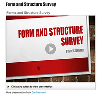
Form and structure survey
In the form and structure survey we asked mainly about the order in which the audience expects to see specific features.
We started with the title where we found that everyone, we asked, expects to see at the end of the trailer.
The next question was on when should our credits appear. We learnt from this that our audience expects to see them either in the middle of the trailer or towards the end. This was expected because of the research we had preciously done on trailers, that also didn’t show the credits until the middle of the trailer. When planning the trailer, we decided on showing the credits in the middle because it was highly expected however when producing the trailer, we started placing the credits in between the beginning and middle of the trailer because this allowed for the credits to become more easily spread out, so to not overwhelm the viewer as well as allowing us to place them in more strategical places that complemented the order of our trailer.
Then we asked what background our credits should have, where everyone we asked wanted the credits should be placed between each shot with their own background. We believed that this was a good idea because when we did our research on trailers, we discovered that almost all of the trailers we had analysed presented their credits on separate backgrounds in between shots. From the survey, we could see that this was definitely expected for a trailer and therefore we wanted to continue this in order to allow our trailer to look professional.
Our fourth question was on the expectations of when we should show high climax in our trailer and the responses were very strongly for being in the middle of the trailer. We decided to begin the high climax scenes within the middle of trailer because we agreed that the audience needed to be excited and thrilled at this point in order to continue watching the trailer. We did take into account that some of the people, we asked, wanted the high climax scenes to be at the end of the trailer so we continued to show high climax scenes all the way to the end of the trailer as to keep our audience on the edge of their seats.
Next we asked if the audience expected fast pace cuts from a superhero trailer and the response was strongly for having fast pace action shot. When producing the trailer, we did realise that some of the scenes where best presented through fast pace cuts in order to keep the tension between shots but we did add an edgy and more interesting transition because we also realised there had to be variety within the flow of the trailer otherwise it wouldn’t be able to build up. This transition is seen when there are two running scenes and we use the scene where she is running towards the camera to split in half and open up so that we can see the scene where she is running away from the camera.
From the previous question, we went on to ask a following question about when the audience expected the fast pace action to appear, if they said yes to the previous question, and the majority said they wanted to see this from the middle of the trailer to the end. When producing our trailer, it became clear that they best way to present the narrative and keep the audience excited was to have the fast pace action appear from the middle to the end, as already mentioned in previous questions.
The next question asked about wen the audience expected the music to begin and from the audience feedback we learnt that there was a range of expectations for this. In the end, we decided on the soundtrack to start when the production logo appeared because we wanted to let the music ease in to the trailer so that it wasn’t fully playing when the first shot appears but there was some music in the background for when the first shot appeared. This wasn’t the most popular choice from the survey but it worked best for our trailer and will be more effective if it is introduced before the first shot.
There are a variety of ways in which to explain the narrative and when asking this question, we received a mixture of result. This was expected because when researching trailers, we were presented with three main ways of doing this, voiceover, dialogue and credits, and they all impact a trailer. We decided on a voiceover and credits because this will allow for us to present the narrative in two different forms and it keeps the audience interested.
The last two question came back with everyone expecting the same appearance for the production and distribution logo. Due to the high expectancy of the production logo and distribution logo to at the beginning of the trailer, we easily decided that this is where they should go because placing them there would make our trailer look professional.
The audience feedback from this survey has helped us to really analyse the order of our trailer and understand the expectation of our audience when the watch a trailer so that we can create a professional looking trailer. Furthermore, we are able to challenge a few expectations for the structure of a trailer to keep it new and interesting for the viewer.
CLICK THE IMAGE BELOW TO BE TAKEN TO THE BLOG WHERE YOU CAN VIEW THE FORM AND STRUCTURE SURVEY POWERPOINT:


Title survey
In the title survey, I asked what font would reflect a superhero film and the audience response was strongly for the Comic Sans font. We were able to go against the expectations of a typical superhero font because we decided that the trashed font would better suit the rough and edgy style we wanted to present. From this, we could then create a bolder impact on the screen for the title, which is what is expected for a trailer.
The next question, we asked about the colours that would best suit the title and from researching trailers, I knew that there were similarities in colour themes throughout superhero film. The majority of our audience wanted us to use black, blue and yellow colour, which are expected within the superhero genre and we decided to use them because it was an indication that we should be trying to present the superhero genre as best we could within the trailer in order to portray this to the audience as quickly as possible so that our target audience is easily draw to the film.
Our third question was on whether we should use a 2D and 3D effect on our title. We decided that to create a greater impact on the screen our title would have a 3D effect on it. The majority of people, who voted, agreed that this would complement the design and create more depth to the title design. I believe that this impacted the final product massively because it allowed for the title to lift off the page and stand out in front of the dominating and complex edit of the background shot that we chose to use.
Then we asked if we should use a shot for the background and as said in the previous question, we did decide to do this. The majority of the people, who voted, agreed that we should use a shot for the background of the title and I was unsure at first because we weren’t exactly sure on the shot that we would use and whether it would complement the title. As well as that, when researching superhero trailer the majority of trailers had a separately designed backgrounds for their title and weren’t sure if we wanted to follow this expectation or not. However, the audience feedback told us that not all the audience was expecting that and it encouraged us to go against what we had seen when researching trailers. I believe that this was a good choice now because the title has so many complex layers and has a bold impact when it appears within the trailer, that is almost unexpected but complementary to the style of our trailer.
The next question talks about where the title should be placed on the screen and the majority of people wanted it to be placed in the centre of the screen, which is to be expected because this is where the majority of all film titles are places on the screen so to get everyone’s attention. However, our title was on top of a shot and therefore we had to consider what the title maybe covering up on that shot. This influence where we placed our title more than the audience feedback did because they hadn’t seen the shot so they wouldn’t know where the title would be better place. We decided to place at the top middle part of the screen so that the audience had a good view of the shot but the title was still noticeable on the screen.
Our sixth question talks about the effect that our title should have and the majority of people wanted our title to have a glare effect on it. This was expected because the majority of film title contain a glare effect on them but in our film trailer we had already previously used a glitch edit so it seemed more complementary and appropriate to use the glitch effect than a glare. I believe this worked out better for the style of our trailer because the distorted atmosphere was continued throughout the trailer by the glitch effect and we were able to present this within the title edit.
Then we asked if the non-diegetic music should play when the title appears and everyone agreed that it should. This was an easy choice to make because when researching trailers, it was clear that the soundtrack was expected to play through the title and sometimes we found it built up when the title appeared on the screen. This definitely enhance the effect of the title when it appeared on the screen and emphasised its presence.
Following this question, we asked if the music should increase or decrease at this point in the trailer and the majority of people agreed it should build. As said above, I think that the build-up of music increases the anticipation of the audience and therefore excites them more throughout the trailer so we did decide to increase the music at this point. I believe it worked very well and emphasised the impact of the edits and effects that we had added to the title as it appeared and disappeared.
The next two question talk about the effects that should be added to the appearance and the disappearance of the title.
In the appearance question, the most popular option was the dissolve effect. Alternatively, we decided on the fade transition, even though it was second popular, because we believed it complemented the style and flow of the shot, as it would make a cleaner entrance for the title. In the disappearance question, they were asked if we should even have an effect for the title and the majority of people voted that we should.
The following question to this was what transition should we have. We decided that to create a smoother flowing ending to the shot, we would add a disappearing transition for the title. The most popular option for the disappearance effect was to have a dissolve. Due to the fact, that we decided that we wanted a fade transition for the title to appear in then to disappear we should use the same transition in order to keep the transitions complementary to each other. I believe this was the correct decision because the title shot was very heavily edited and the simplicity and smoothness of the fade effect was able to flow perfectly with the shot.
click the image below to view the title survey powerpoint on our blog:

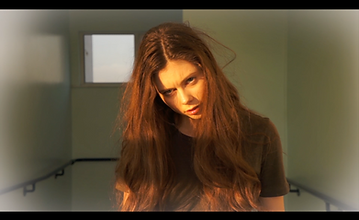
Watch the video to see the final title design on our trailer.
Rough cut
In the rough cut survey we asked about specific scenes and features, that we put in our trailer, to see if there was anything we needed to change or add to the production of our trailer.
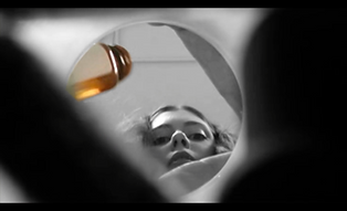
The first question was about the black and white edit that we used for the hospital scenes. We wanted to know if this edit portrayed an isolated and ominous atmosphere to our audience and everyone agreed. From this, we could see that the edit worked exactly the way we wanted it to and there was nothing to change within this scene.
The next question was about the title effects and whether it was presented as too overwhelming for the audience as we were concerned that there were too many layers and complexities to this edit. The majority of the people we asked, said that its wasn’t too overwhelming but a small percentage did think it was too much so from this we decided to create a much smoother transition between the edits in this shot. I believe this was the main problem with the title edits as the transition were too harsh and this exaggerated the effects on the title and was the cause of the overwhelming representation. Once we had corrected this, I believe everyone agreed that quality of the title improved and wasn’t overwhelming.
The third question was about the feature we should use so that the audience understand our narrative better. This was previously answered in the form and structure survey, however when we came to producing the trailer we had a few problems with the credits explaining our narrative so we decided to ask another audience as they watch the rough cut of the trailer, which one would better fit the trailer now. The majority of the audience split between dialogue and voiceover. We had already added a voiceover so we felt that because this had such a strong vote for it, that we should keep it in. The use of dialogue also had a strong vote for it so we decided to try and incorporate that into our trailer as well. In our final product, I think that this decision worked really well when explaining the narrative to the audience because the use of voiceovers and dialogue made it easy for the audience to follow what was going on and continued the flow of the trailer.
Then we asked about the use of instruments in the music because we were still working on the soundtrack at this point and we wanted some advice on what would best suit the trailer. This was a multiple choice question so it meant we got a strong vote for the use of strings, bass and drums within the soundtrack. In the end, we did decide on going against the most popular voted instrument, such as strings, because we wanted a heavy beat for the high action scenes, which would include bass and drums, as well as a distorted twist to the soundtrack, which would include synths. The synths got the lowest vote because they aren’t typically used with a superhero film but we wanted to add something unexpected and sinister to the hospital scenes, to make our trailer stand out from the crowd. I believe this worked very well for the representation of the hospital scenes and really increased the tension within those scenes.
The final question talks about the use of props within our trailer and whether they think we presented them well and everyone agreed that we did. I believe this is true because we tried to use our props effectively, such as the medication that Clary has to take, to enhance and emphasise their purposes.
The rough cut survey helped us so much in the final edits and construction of our trailer. We were able to look at the feedback and make changed based on other people opinions so that we could create an enjoyable and exciting trailer for a wide range of audiences.
click the image below to view the rough cut survey powerpoint on our blog:

In the ancillary task we got feedback from our audience once we had produced the first daft. This then helped us to develop and change any part of the ancillary that needed to be as well as make sure that all the features for that ancillary task was present.
Magazine
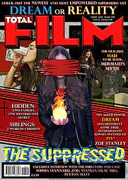
Once I had made my first draft of my magazine front cover, I showed it to an audience who helped me create a clear understanding of what they thought needed to be improved. The tones on the first draft were very dark and this made it hard create depth between each of the images and some didn’t present the same amount of detail shown in the original photo. Therefore, I used a brightening tool to enhance the darker tones and make them lighter so that the images could be more defined. I believe this worked well because the images became much more eye catching and detailed. Plus, I found that the text stood out in a fine and clean way that allows the viewer to read easily. The majority of the audience feedback also said about adding a stroke and back drop effect to the text so that they would lift of the page and draw the reader’s eyes to them.
Poster
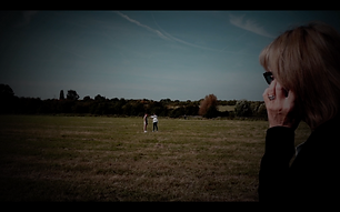
I got audience feedback from the very beginning of making my poster. This was due to the fact that I was undecided on what background image I should use. I asked a group of people to select their favourite image that would work best with my design. I did this by creating a very rough sketch of what I planned to do for the main design and features and then showed them the selection of photos I had to choose from for the background of my poster. From there, I got to see understand the ideas and preferences of my audience, who then guided me into choosing the image that I think worked the best out of them all. The background image, I had chosen, was from the location of the corridor scene within the mental hospital. The majority of people I asked chosen this because of the variety of blue tones and harsh high key lighting that would brighten up the main design I wished to produce on top of the background. The audience, I asked, also had a good understanding and knowledge of what our film was about and from this I believe they had a better knowledge and well educated opinion on why this scene should be chosen because of its importance within the narrative. Overall, the chosen background image complemented my poster perfectly and allowed for the edit on my main design to lift of the screen and made a big impact on the audience’s first thoughts of the film because it presents an ambiguous and intriguing statement.
Once I had made my first draft of my poster, I showed it to an audience (along with the magazine) to help me make the improvements and changes that were needed. The audience feedback was very positive because I got their opinion involved at the beginning of the production of the poster. However, I did decide to make the text clearer and illuminated with the stroke and back drop effect that had been suggested for me to use when receiving feedback for my magazine front cover because I was able to see similar problems with the readability of the text. This enabled the text to become defined and colourful.
Website
Before we published our website, we got audience feedback on the first draft. As we created it on Wix, we were able to give our audience a preview of what the website would be like, which became very helpful for us because our audience was able to experience what it would actually be like if it was published.
The feedback reminded us that we needed add a button on the homepage about buying tickets to see the film. They also help inspire the design for the button as to make it attractive and appealing to the viewer. We decided on a simplistic but bold colour scheme of black and vibrant yellow to match with the title of the film. The strip is black and the text across as well as the button are bright yellow so that they illuminate off the page and make it unmissable for the viewer. I think it works really effectively because it matches with the style of the website but has a powerful presence on the page. In addition, we also changed the colour and font of the text because the audience feedback told us we needed to make the text match the website theme better. I agreed with this because after we started to experiment with fonts and colours I found that the previous style didn’t fit the themes of the film at all because it was too fine and dull. We changed the font to Lulo Clean, which is very bold and thick, and the colours range between the vibrant white, yellow and blue because they are the colours we used for the colour scheme of our film. I think these colours work perfectly with the design of the website and the font makes our text stand out with its bold definition.


CLICK THE IMAGES BELOW TO BE TAKEN TO OUR BLOG WHERE YOU CAN VIEW THIS PRESENTATION.
CLICK THE IMAGES BELOW TO BE TAKEN TO OUR BLOG WHERE YOU CAN VIEW THIS PRESENTATION.
CLICK THE IMAGES BELOW TO BE TAKEN TO OUR BLOG WHERE YOU CAN VIEW THIS PRESENTATION.

